I’m posting this here because, as far as I can tell, it is an issue with the Discourse side of things. None of the CSS involved is part of the comics app backend; it all comes from the Discourse server.
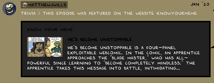
It appears that the dark-themed Discourse CSS is clashing with the lighter theme applied when a Discourse discussion is embedded onto swordscomic.com, when it comes to the display of OneBoxes.
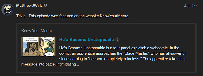
The on-Discourse theme shows OneBoxes with a dark background, light text, and blue links, giving this appearance:
When that same OneBox is embedded in the on-site comments for that comic, the onebox.sccs styles get overridden by a second file, theme_1.scss, which includes the following style rules:
aside.onebox {
    border-color: black !important;
}

aside.onebox header a[href] {
    color: black;
}

aside.onebox .onebox-body a[href] {
    color: black;
}

aside.onebox .onebox-body a[href]:visited {
    color: black;
}
That leaves the OneBox looking… less than stellar. (More to come, as I’m a n00b and limited to one embedded image per post.)


